In today's digital world, your website is your storefront. And just like in the real world, people judge that storefront quickly—within just a few seconds. The layout, logo, colors, fonts, and imagery either draw someone in or push them away. You don’t get a second chance at a first impression.
At Ksoft Technologies, we understand that trust isn’t built just through code or features. It starts with how your brand feels the moment someone sees it. As a top-tier software development company USA with strong market share in the U.S. and Canada, we specialize in building both functionality and credibility into our digital products—from responsive web design to custom software development services.
Let’s explore how your visual identity—your logo, fonts, colors, and imagery—can build trust with first-time visitors and convert them into loyal customers.
1. Color Psychology: Trust Begins With Tone
Colors affect perception instantly. Whether someone knows it or not, their brain is decoding your brand’s emotional tone through color. That’s why choosing the right palette matters deeply when we provide website design AI services to clients across industries.
Here’s a breakdown of what common colors say to your customers:
- Blue: Communicates trust, security, and professionalism. Common in tech, healthcare, and finance.
- Red: Conveys urgency, excitement, or power. Great for CTAs or bold ecommerce brands.
- Green: Evokes balance, health, and nature. Ideal for wellness, agriculture, or eco-conscious businesses.
- Black and Gray: Suggest luxury, authority, or sophistication. Works well for high-end or B2B brands.
- Yellow and Orange: Indicate friendliness, warmth, and playfulness. Excellent for approachable, consumer-focused platforms.
When we build brands for clients, we ensure these colors are used consistently—from logos to buttons to background highlights. Color harmony is essential not just for aesthetics, but for the kind of emotional connection your audience forms with your business.

2. Fonts Speak Before Words Do
Fonts may look like a small part of your website—but they are a massive part of your brand voice. The right font makes you look credible, sharp, and intentional. The wrong one can make you seem outdated or untrustworthy.
At Ksoft, when we consult on web design services in USA, we look at typography as tone:
- Sans-serif fonts (like Roboto, Lato, or Helvetica) = modern, clean, easy to read
- Serif fonts (like Merriweather or Georgia) = classic, trustworthy, slightly formal
- Script or decorative fonts = playful or stylish, but use sparingly
Here’s our advice: Stick with one heading font and one body font. Don’t go overboard. Typography should guide the user—not distract them.
Especially in mobile experiences, where screen space is limited, font choice directly impacts how easily users can navigate and understand your brand offering.
3. Logos: Your Entire Business in One Symbol
Your logo is more than a pretty mark—it’s a promise. It’s a handshake with your audience, saying, “This is who we are.”
Every logo we design or refine during our custom software development services aligns with key principles of trust-building:
- Simplicity: A clean, well-balanced logo is more memorable and versatile.
- Scalability: Your logo must look good on a mobile screen, business card, website header, and even a billboard.
- Timelessness: Avoid trendy designs that might look outdated in a year. Go for longevity.
- Consistency: The logo should work well in color and in black-and-white, on light or dark backgrounds.
When done right, a logo becomes shorthand for trust. Think of Apple’s bite, Amazon’s smile, or Nike’s swoosh. Our branding team at Ksoft helps businesses build these kinds of identities as part of full-service web and ecommerce website development projects.
4. Imagery That Feels Real and Relatable
Images are not just decoration. They’re a storytelling tool. They show your audience who you are and what you care about.
At Ksoft, we encourage all clients to avoid generic stock photos when possible. They might be high-res, but they often feel artificial. Instead, we help source or create images that:
- Feature real people (your team or customers)
- Show your product or service in action
- Include contextual backdrops that mirror your brand story
- Reflect diversity and inclusion, appealing to a wider demographic
In our mobile app development work, particularly in Flutter app development services USA, we ensure app screens are shown in real-world settings. This builds context and trust for potential users.
Remember: authentic imagery boosts time-on-site and increases conversion rates.
5. Responsive Web Design is Non-Negotiable
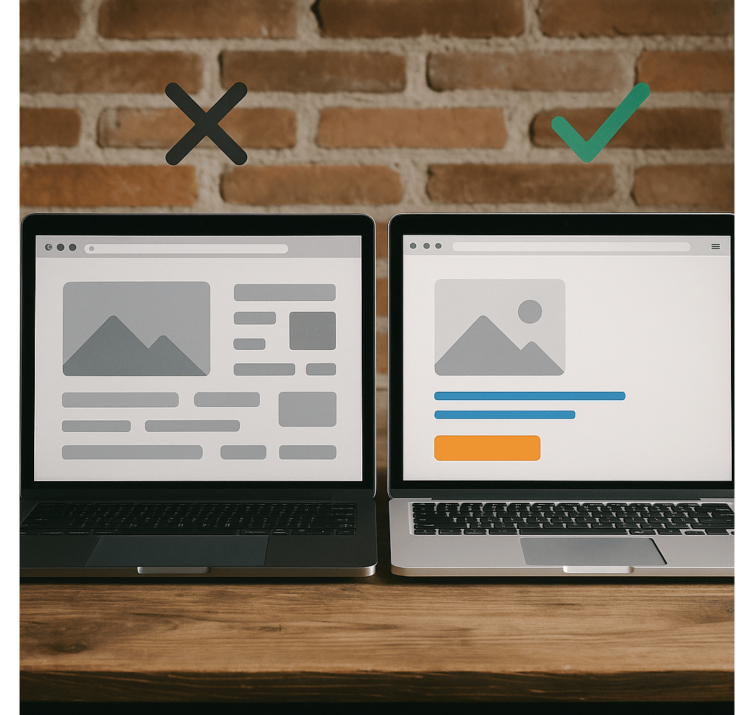
We can’t stress this enough: if your website isn’t responsive, you’re actively losing trust and revenue. Nearly 70% of users will bounce if a site doesn’t load well on mobile. That’s not just poor design—it’s poor business.
As a leader in responsive web design and ecommerce and custom development, Ksoft guarantees that all web projects look and perform seamlessly across devices. Whether your audience is browsing from an iPhone, Android tablet, or large desktop screen, the experience must remain consistent.
Good design earns credibility. But great responsive design retains it.
6. Consistency = Credibility
If your color palette shifts across pages, your logo appears differently in your mobile app versus your website, or your font changes mid-scroll, users start to question your professionalism.
Consistency is what transforms your logo into a legacy.
That’s why our teams—whether handling Android app development company projects or full-stack custom builds—follow strict brand guidelines. Every touchpoint, from login screens to landing pages to invoices, reflects a single, unified brand voice.
And this doesn’t just look good—it builds brand memory. That’s what keeps your business top of mind when the customer is ready to convert.
7. Real Examples, Real Results
Let’s talk proof. Here are a few success stories we’ve seen at Ksoft Technologies:
- Legal Tech Platform, New York: They had strong tech but weak design. We revamped their logo, typography, and homepage UX. Outcome? 38% increase in demo sign-ups in 60 days.
- Ecommerce Clothing Brand, California: Their brand looked inconsistent across mobile and desktop. With a redesign and new color palette, we saw a 56% increase in cart completions.
- Healthcare CRM Startup, Chicago: During our custom CRM development company engagement, we paired a clean UI with soft, trustworthy color schemes and clean iconography. Within 90 days, their user onboarding time dropped by 40%.
Good design isn’t a cost. It’s an investment that pays off.
8. Your Brand Identity is a Sales Tool
Visual identity isn’t just a “branding” topic—it’s a sales strategy. Think about how many times you’ve judged a company based on its website before even reading a single line.
People buy from brands they trust. And they trust brands that look the part.
If you're searching for app developers near me USA, what catches your eye first? A clear, professional, responsive site with confidence-inspiring design—or a cluttered page that feels outdated?
We help businesses deliver that first, powerful impression. And we bake trust into every button, background, and brand asset.
Final Thoughts: Your Logo is Just the Start
Branding isn't just about how your business looks—it's about how it makes people feel. At Ksoft Technologies, we don’t just build platforms. We build confidence, authority, and loyalty through every design decision. If you’re ready to build a brand that people remember and recommend, we’d love to help. Whether you need a full redesign or support with ecommerce website development or a high-performing mobile app, you’re in expert hands.