

In today's mobile-driven world, having a responsive website is no longer a nice-to-have—it’s a must. At Ksoft Technologies, a leading software development company in the USA with a strong presence across the U.S. and Canada, we specialize in crafting custom software and mobile solutions that help businesses stay ahead of the curve. Our expertise in responsive web design ensures that your brand not only looks professional but also performs flawlessly across all devices.
Whether your customers are browsing from a smartphone on the go or from a desktop at work, your website should deliver a seamless, frustration-free experience. A responsive design is essential to keep users engaged, lower bounce rates, and boost conversion.
Let’s dive into the key reasons why responsive website design is so important in 2025—and how Ksoft can help you leverage it for real growth.
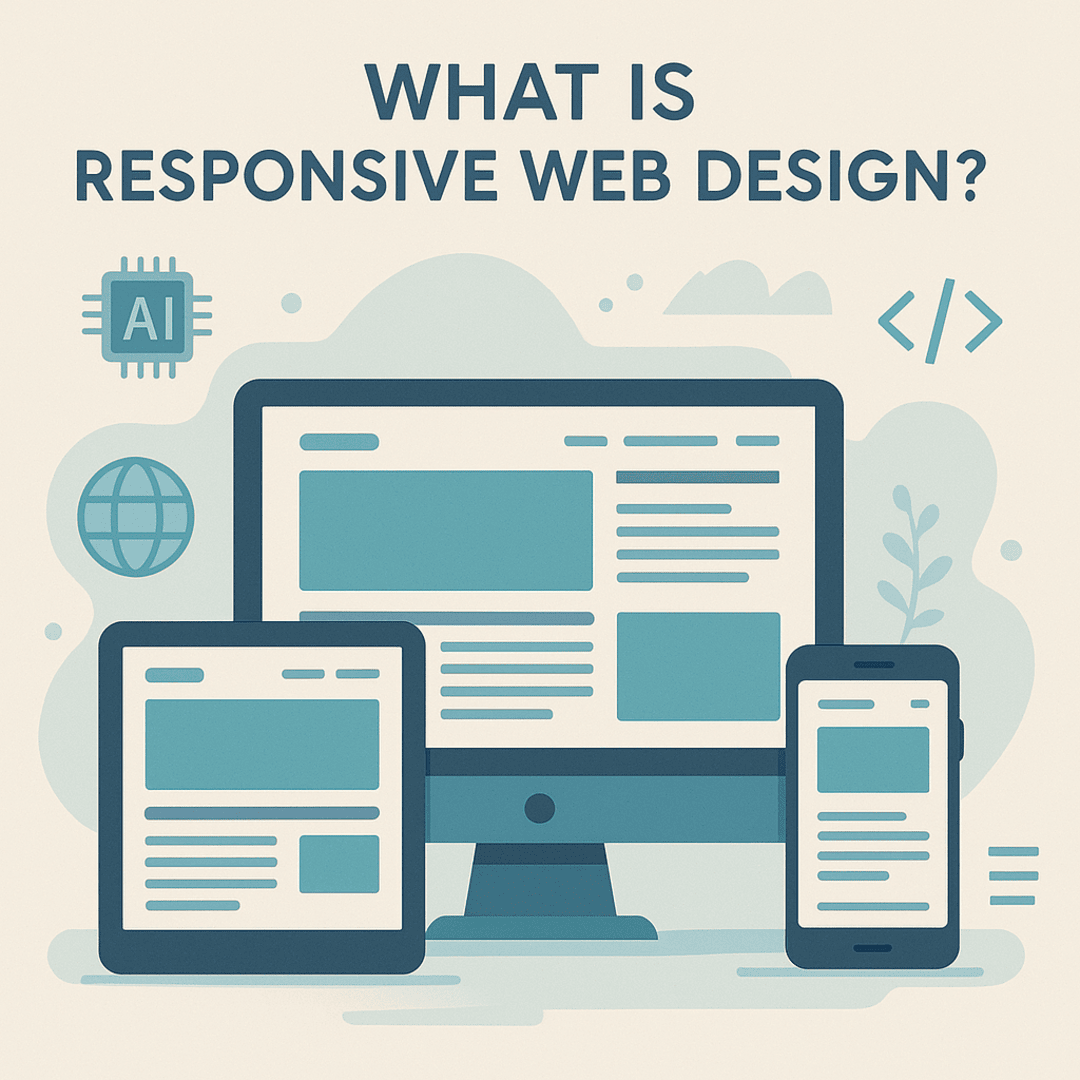
Responsive web design is the process of building a website that automatically adjusts its layout and elements depending on the device being used. Whether it’s a desktop, tablet, or smartphone, the user experience remains consistent and fluid. This method eliminates the need for separate mobile and desktop sites, saving both time and cost.
At Ksoft Technologies, we implement industry-leading practices in web development AI to ensure every design is intelligent, adaptive, and user-friendly.
First impressions are everything online. A responsive website means visitors won’t need to pinch, zoom, or scroll awkwardly to navigate your site. All content, images, and buttons resize and reposition automatically for the best viewing experience on any screen.
Users are more likely to stay on your site, engage with your content, and convert into paying customers when the experience is smooth. Poor mobile usability, on the other hand, is a fast track to high bounce rates.
Did you know that mobile conversion rates are significantly higher than desktop? Statistics show that smartphone conversions are up to 64% more effective when the site is mobile-friendly. Redirecting visitors to a separate mobile version disrupts the journey and often leads to lost sales.
By building a single responsive site, Ksoft ensures a consistent experience for all users—maximizing the opportunity to convert every visitor. This makes it easier for users to navigate, click, and buy without hassle.
Google has made it clear—mobile-first indexing is the standard. This means Google predominantly uses the mobile version of your site to determine its ranking. If your site isn’t responsive, it could fall behind in search results.
Responsive design prevents the problem of duplicate content, which occurs when businesses maintain separate desktop and mobile sites. With one URL and a unified design, your website becomes easier to crawl, index, and rank.
Ksoft’s SEO experts optimize every responsive project with best practices in mind—SEO for responsive sites is built into our development process from day one.
Maintaining two websites—one for desktop and one for mobile—is time-consuming and costly. A responsive website saves you hours of work by consolidating everything into one place. Whether you're updating product listings, adjusting content, or launching a seasonal campaign, changes can be made once and reflected across all devices.
Smaller teams benefit immensely from this efficiency. Ksoft’s custom software development services streamline content management and allow for real-time changes with minimal effort.
When users encounter a site that doesn’t work properly on their device, they leave—fast. Responsive web design significantly reduces bounce rates by keeping users engaged and guiding them smoothly through your content.
The longer someone stays on your site, the more likely they are to take action. Responsive design increases session duration and page views—both of which send strong positive signals to search engines.
Over 60% of all internet traffic now comes from mobile devices, and that number is only growing. If your website isn’t optimized for mobile, you’re missing out on a massive chunk of your potential audience.
A mobile-optimized website brings in more qualified leads and improves the overall ROI of your digital marketing efforts. That’s why responsive website design is central to every project we deliver at Ksoft Technologies.
With a responsive site, you don't have to worry about every new screen size or operating system that hits the market. Responsive design adapts automatically. This kind of flexibility is crucial for businesses that want to stay relevant and agile in a fast-changing digital environment.
From adding new features to redesigning UI elements, our designs are built to scale with your business.
When your audience shares links to your site on platforms like Facebook, Instagram, or LinkedIn, they expect it to open flawlessly on any device. Responsive web design ensures your content looks good and functions well when shared—driving more traffic and engagement.
Plus, embedded share buttons can be optimized for smaller screens, making it easier for users to promote your brand organically.
Managing one website with one unified content strategy is not only more efficient—it’s smarter. A responsive design allows your content to remain consistent, avoiding the headaches of duplicate copy, mismatched branding, or analytics complications.
Our team at Ksoft builds CMS-integrated websites where you can update text, media, blogs, and banners from one simple dashboard.
When you have one responsive site, tracking becomes more straightforward. You don’t need to analyze two sets of metrics for mobile and desktop. All your user data, behavior, bounce rate, and conversion tracking is housed under one domain.
This allows for more informed business decisions and better performance optimization across the board.

At Ksoft Technologies, we don’t just build websites—we craft digital experiences that deliver real results. From responsive web design to ecommerce and custom development, we provide end-to-end solutions designed to scale with your business.
Here’s what sets us apart:
Whether you're searching for app developers near me USA or need full-cycle digital transformation, we deliver with quality, consistency, and results.
If your business is ready to step up its digital game, let’s talk. At Ksoft Technologies, we combine the latest in design, technology, and user behavior to deliver websites that are not just responsive—but results-driven.
Let’s create a site that attracts, engages, and converts—on every device.