A logo isn’t just a graphic—it’s the face of your business. It introduces your brand before a single product is viewed or a service is explored. For businesses building a strong digital presence through custom ecommerce website development, choosing the right logo is a foundational step that can influence user engagement, brand recall, and trust.
At Ksoft Technologies, a leading software development company USA specializing in responsive web design, ecommerce solutions, and mobile applications, we always emphasize starting with a solid brand identity. Your logo speaks louder than you think—it gives your business personality, visual memory, and trust in the blink of an eye.
So, before diving into development, here’s a smart branding guide covering 7 different types of logos—and how each can play a role in making your business stand out in a competitive online marketplace.
1. Monogram Logos (Lettermarks)
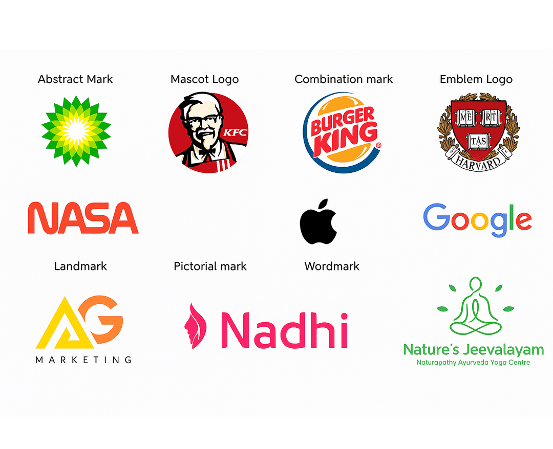
Monogram logos are all about initials. Think IBM, HBO, or NASA. If your business name is a mouthful, converting it into a clean, recognizable acronym can be a smart move.
For instance, “National Aeronautics and Space Administration” is a mouthful—NASA is brilliant and unforgettable. The simplicity makes monograms especially ideal for businesses with long or multi-word names.
Why it works:
Monograms streamline branding, especially for new-age tech or custom CRM development companies. These logos scale well across websites, mobile apps, and even favicons.
When to use it:
Perfect if your business name is long or challenging to pronounce, and you want a minimalist yet professional identity. Just make sure to pair it with a clear, legible typeface and, initially, consider placing your full business name underneath until your brand is well known.
2. Wordmark Logos
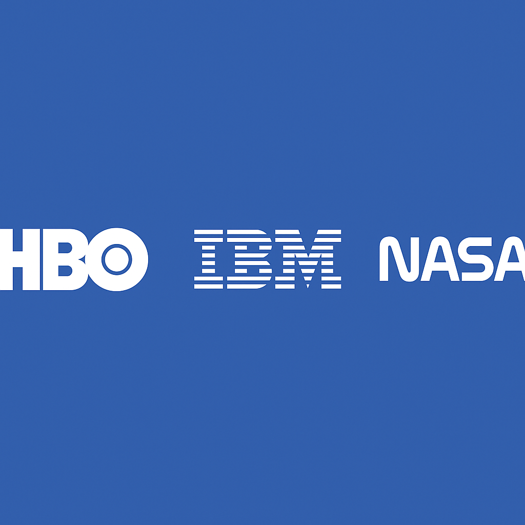
This is a logo based solely on the business name, with no icons or symbols—just pure typography. Think Google, Coca-Cola, and Visa. The key here is choosing a typeface that mirrors your brand's voice.
Why it works:
Great for new businesses where name recognition is crucial. A strong, clean typeface creates memorability and trust, especially if your business name is unique.
Where it's effective:
Ideal for brands just entering the ecommerce world, such as ecommerce and custom development stores, SaaS platforms, or startups offering Web Development AI solutions.
Pro Tip:
If you’re in the fashion, legal, or creative industries, tailor your font style accordingly—elegant for fashion, bold for tech, and classic for law firms.
3. Pictorial Mark Logos (Logo Symbols)
These are icon- or image-based logos. Think of the Apple logo, Twitter bird, or Target bullseye. They rely heavily on brand recognition and symbolic connection.
Why it works:
Images speak across languages. Once established, a visual logo is powerful and recognizable even without text.
When to use it:
These are best suited for established brands or businesses with clear symbolic direction. For example, a wellness brand might use a lotus or leaf, while a tech brand may opt for a pixel or futuristic shape.
Ksoft’s take:
We often recommend pictorial marks for ecommerce platforms looking to scale globally. They blend beautifully with responsive web design elements and mobile interfaces.
4. Abstract Logo Marks
This type steps away from recognizable icons and leans into shapes, patterns, and geometry—like Pepsi, Adidas, or BP. The idea is to evoke emotion and meaning through design alone.
Why it works:
Abstract logos are perfect for companies wanting to convey concepts like innovation, transformation, or energy—common in custom software development services and tech startups.
How to make it count:
Color, shape, and balance matter. Think about what emotion or message your design should deliver. Hire a designer who understands visual storytelling through minimalism.
Where it fits:
Abstract logos are increasingly popular among AI-driven startups, fintech platforms, and mobile app developers USA targeting national or global markets.
5. Mascot Logos
Mascots turn your brand into a character—literally. Think KFC’s Colonel Sanders, the Kool-Aid Man, or Mr. Peanut. Mascots humanize your business and add a layer of approachability.
Why it works:
They're fun, memorable, and create a strong connection with your audience. They work great for businesses targeting families, kids, or niche cultural communities.
Best used by:
Brands that want to promote friendliness, interactivity, or nostalgia. Perfect for food brands, edtech companies, and ecommerce platforms with heavy social engagement.
Ksoft Strategy Insight:
Mascots can be excellent for product packaging, social media, or gamification elements in your ecommerce platform—something our Flutter app development services USA team often helps integrate.
6. Combination Marks
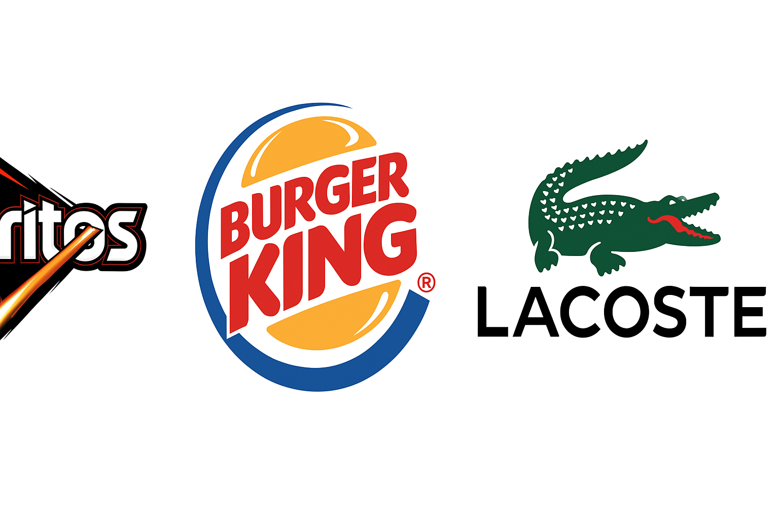
Here’s the best of both worlds—a mix of text and symbol. These logos include a wordmark or lettermark paired with a pictorial, abstract, or mascot icon. Examples? Burger King, Doritos, and Lacoste.
Why it works:
Combination marks are versatile and easy to trademark. They communicate your brand clearly while offering visual engagement.
Where it shines:
If you’re launching a new ecommerce venture or mobile app, this logo type works wonders across digital and print. We see the highest success rate with these among businesses we serve in the U.S. and Canada.
Bonus:
You can later remove the text and rely only on the symbol once brand equity is built. It’s scalable and future-proof.
7. Emblem Logos
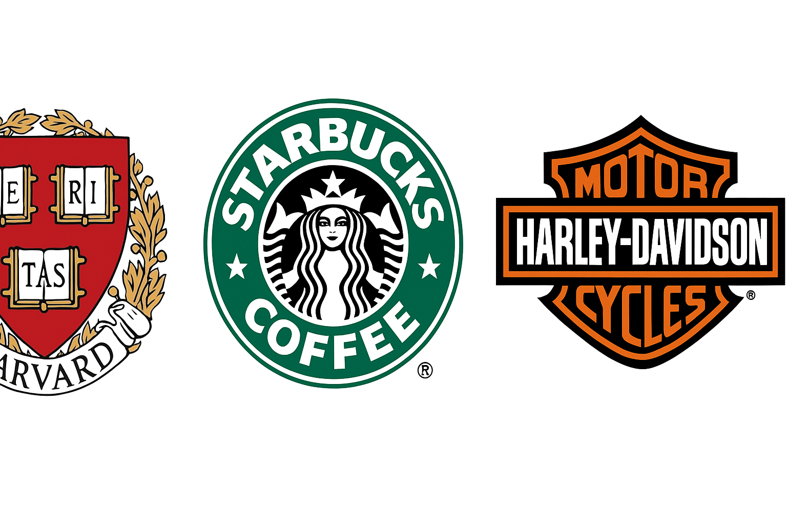
Emblems are the oldest style—text inside a symbol or badge. Think Harvard, Starbucks, or Harley-Davidson. These logos feel authoritative and timeless.
Why it works:
They convey tradition, trust, and legacy. Ideal for universities, craft food companies, breweries, or businesses that want to reflect heritage.
Design caution:
Because of their detailed nature, emblems don’t scale well for small screen applications. Always test the logo across devices before finalizing.
Modern Use Case:
We’ve helped several U.S.-based clients modernize emblem logos using vector shapes and simplified typography for improved UX across web and mobile platforms.
How to Choose the Right Logo for Your Ecommerce Brand
Before picking a logo type, ask yourself:
- How long is my business name?
- Do I need a visual element or is typography enough?
- Will my logo scale well across mobile, web, and packaging?
- Is my brand personality fun, formal, futuristic, or traditional?
If you're working with Ksoft Technologies, our design-first development model ensures your logo is considered right from the strategy phase of building your ecommerce website development or custom software platform. From branding kits to icon systems, we help ensure your visual identity translates flawlessly across every digital touchpoint.
Logo Design Tips from the Ksoft Branding Team
- Keep it simple: Simple logos perform better across platforms.
- Design for versatility: It should look good on mobile screens, letterheads, T-shirts, and social media.
- Use scalable formats: Opt for vector-based files (.SVG or .EPS) to maintain clarity across sizes.
- Color matters: Use a primary and secondary palette. For instance, blue often signals trust and security—perfect for fintech or a software development company USA.
- Hire experts: Your cousin’s Photoshop skills may not cut it. Collaborate with a professional website design company or a design-savvy dev team (like us).
Final Thoughts
In today’s crowded digital space, your logo needs to do more than look good—it must work smart. Whether you're building a custom ecommerce store, developing a CRM, or creating a mobile app, your logo plays a silent yet powerful role in how your customers perceive you.
At Ksoft Technologies, we don’t just build software—we build digital experiences that convert. From brand-first design to full-stack development, our team of the best software developers USA ensures your digital foundation is strong, scalable, and ready to impress.
Need help picking the right logo style or building your digital brand from scratch? We’ve got your back. Let’s build your brand—pixel by pixel, line by line.